I too think this is a step in the right direction. I see that the design principle at work in the new interactions panel is to have all the interactions be a visual block. Generally speaking, I agree with this.
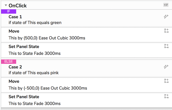
Where it still isn’t working for me is the hierarchy. In the new model, cases “belong” to an IF group or an ELSE group. The visually important thing is the IF or ELSE. Then within that group, everything, conditional logic + interactions, are visually equal:
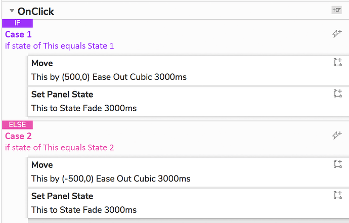
The way I think of cases is that any conditional logic belongs on the same visual level as the IF/ELSE. I see that there’s been an effort to visually differentiate the logic from the interactions, but for me, it’s not enough to be scannable. I would humbly propose that the team consider something like this:
At minimum, having some indentation and not extending the interaction blocks all the way to the edge of the panel would be hugely helpful.
Thanks for reading ![]()

