Please tell whoever keeps "improving" the border button to stop it


#1

I’m looking at you, whoever redid this is AX9 and AX10.

AX8, usable, visible. Updated the actual button to show active borders would be cool, but without that it’s still easy to see and use.
image

AX9, button itself more monochrome and harder to distinguish borders from solid side. Dropdown all monochrome.
image

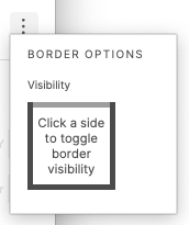
AX10, now we have whatever this is.
image


#2

Hi , completely agree - the selected borders are really hard to see. Also there is an inconsistency with the higlighting of 'Resizing constraints:

image

The active ‘values’ are highlighted in blue, whereas in the ‘border’ dialog, blue is the mouse over colour.

I would suggest to select blue as the standard ‘Selected’ colour, as this is also done in the text alignement buttons etc.


#3

Ax9 was peak border visibility in my book.


#4

WOW! I just spent 20mins trying to find out where in AX10 you “click a side to toggle border visibility”. I seriously thought that was just a message and that I had to go somewhere into the styles panel to turn on borders. Please at least go back to AX9. This didn’t need improving.


#5

I totally agreed!! Haven’t I read your message I wouldn’t know that is how you change the border visibility. I thought it was a message like you. This is crazy!


#6

I think it would be better if didn’t require extra click to see.


#7

AX10 has done a pretty good job of refreshing the UI, absolutely an improvement over 9. However, is there a reason we were able to do this no problem with corner radius
image
and we still have this overengineered widget, locked behind a dot menu for borders still?
image


#8

I spit my coffee out when reading this. Completely agreed.