desktop first. I’m pretty sure using the device-width and the scaling factor has worked in the past, but it ain’t working now!
Why is this so fking hard? Why aren’t there just pre-sets in Axure to export for a particular (popular) phone? What, not enough people have got iPhone 5’s or 6’s or Galaxies? This job has enough challenges, without something that should be really easy being really fking DIFFICULT!!!
Hi ianwest,
I’m sorry to hear that you’ve had some trouble with the adaptive views in this prototype. I think that including device-specific presets for adaptive views and the viewport tag is a fantastic idea, and I’ll make sure to bring this up with our product management team for consideration.
To address your immediate concern: It sounds like the issue is that the viewport for your iPhone 6 does not meet the conditions for the mobile adaptive view breakpoint in the RP file. Is the breakpoint condition “is less than or equals 320”?
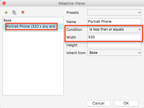
If so, the prototype will only switch to this view when the viewport of the device is 320px wide or narrower. There are a couple ways to get the mobile view to display on your device:
-
Change the breakpoint condition to “is less than or equals 375” and use “device-width” as the width setting for the viewport tag. The iPhone 6’s viewport width is 375px, so this will satisfy the breakpoint condition and display the mobile layout on your phone.
Please note that doing this will not change the width of the page content itself. If you need the page content to fill the full width of the iPhone 6, you’ll need to ensure that the content’s total width is also 375px instead of 320. -
If you’d prefer not to change the breakpoint condition or the page content’s width, you can instead change the viewport width to “320” with no initial scale value.
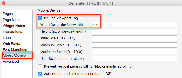
This will override the phone’s native viewport width and instead display the prototype as though the viewport width were 320px. (Note: This will not affect desktop viewing, but this setting will apply to all mobile devices.)

I hope this helps to get you back up and running with this project. If you have any questions, please let me know. Also, if you’d like more specific feedback for your prototype, feel free to post the file here for me to look at. Alternatively, if you’re unable to share it here publicly, please email it to us at support@axure.com with a link to this forum thread.
1 Like
I’ve got some built in configurations for popular devices in my framework (free download):
I’m pretty sure iPhone 6 is in there. There’s a link to a video guide on that page for how to design & generate for different devices.
I rarely have a requirement for producing specifications for multiple small devices. I design at the smallest sizes, e.g. 320px wide for mobile, to validate the layout works at the smallest screen size for that range (design for size ranges not breakpoints), and tell the developers to work out the % values from my specs.
Hello guys,
I’m trying to set up those adaptive Views for iPhone 5/5s/SE, iPhone 6/7. I’m really frustrated because my iPhone 6 doesn’t recognize the correct adaptive View from the iPhone 6/7 with the width: 750. Instead it displays the screen from the adaptive View iPhone 5 (640 width)
Base:
Width: 640
Height 1136
iPhone 6/7:

My Viewport Looks like this:

Is there sth wrong?
I also tried:
iPhone 5: 320x568
iPhone 6: 375x667
Initial scale: 1.0
Would be really nice if someone could help me…
Thanks!
Hi Andreas95_21!
It looks like you’ve entered the value of the display resolution/pixel density as opposed to the viewport’s reported width. For an iPhone 6, the reported width is 375 pixels. An iPhone 6+/7+ reported width is 414 pixels.
Here are a few resources that might help for reference:
http://vizdevices.yesviz.com/article.php
http://www.canbike.org/CSSpixels/
https://www.paintcodeapp.com/news/ultimate-guide-to-iphone-resolutions
Can you give that a shot in your project? Hopefully that helps!