Hello Forum,
I am working on mobile demo for iPad and iPhone. And I faced many issues. Preview. I also trued to publish it Here
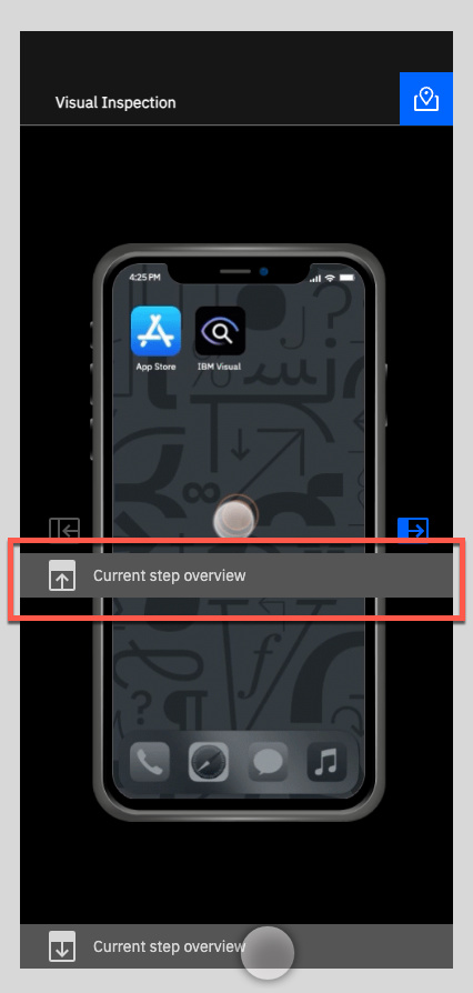
Here screenshot
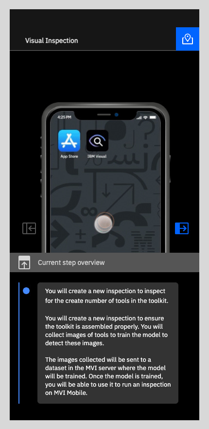
and after refresh it is look like that
Hello Forum,
I am working on mobile demo for iPad and iPhone. And I faced many issues. Preview. I also trued to publish it Here
Here screenshot
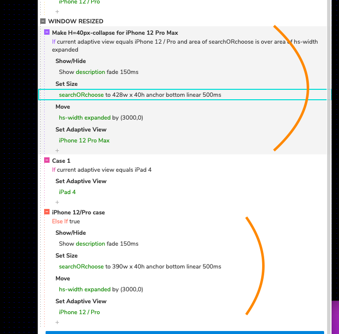
Hey @bermanatalie, it looks like the “description” group for the “iPhone 12 Pro Max” adaptive view was hidden, that’s why you couldn’t see the dynamic panel “searchORchoose” when you selected this view:
Then, once it was fixed I noticed that width of this dynamic panel was set to 390 px instead of 428 px for the “iPhone 12 Pro Max” adaptive view on the page’s “Window Resized” interaction, so I slightly changed these conditions by putting “Set adaptive view” to other actions and adding this view to the resizing condition.
Some interactions for the iPhone views for this dynamic panel and hotspots were a little bit mixed, so I edited them as well. I’ve also put the edited file here: Dropbox
This topic was automatically closed 14 days after the last reply. New replies are no longer allowed.