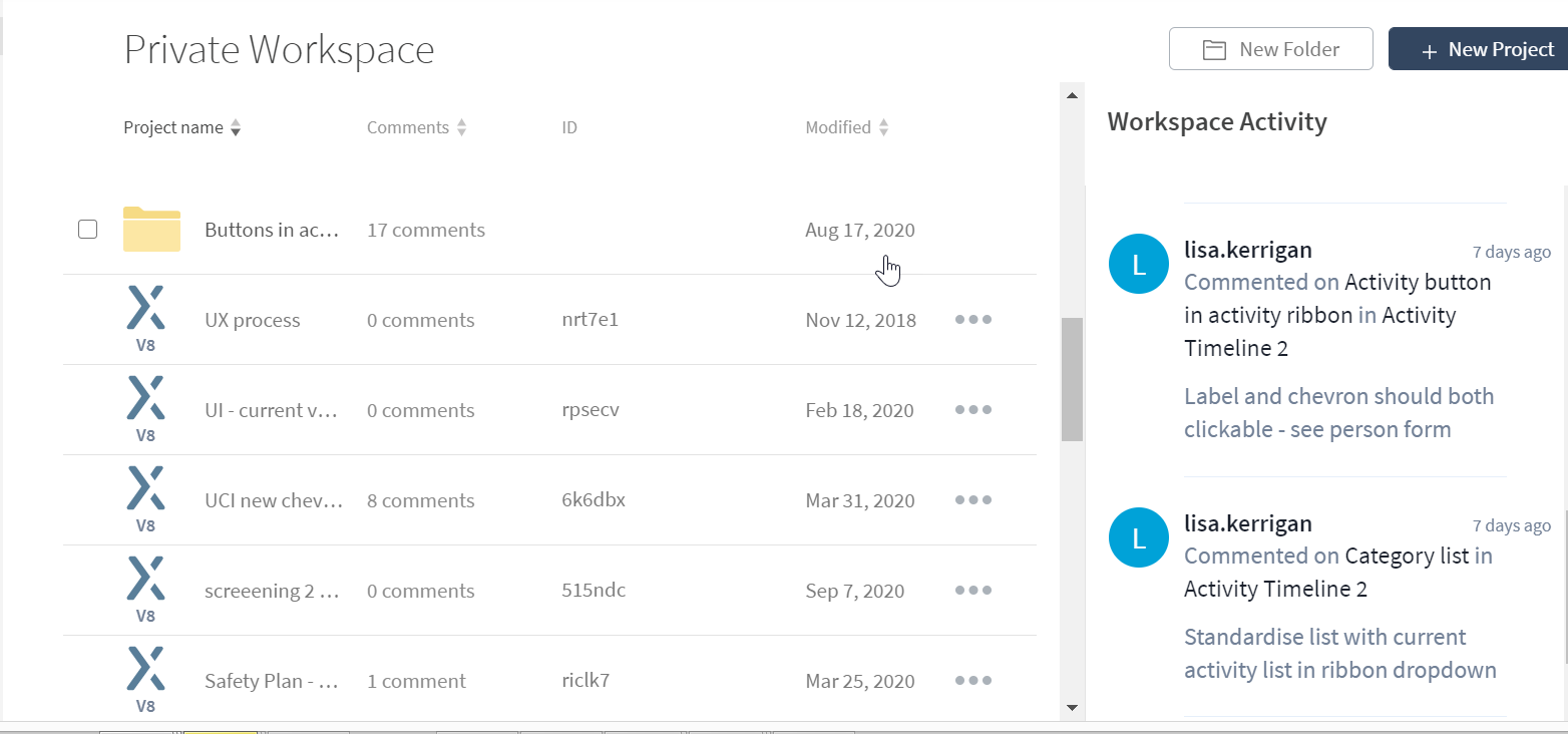
Interface for Axure Share is really annoying. Column length for project name is too small to read a meaningful name and yet you’ve given a whole lot of space to repeating the word “Comment” in comments column (value zilch) and a whole lot of white space between ID and Modified, and then a whole lot of space to activities which I only want to read if I select, Can you redesign and give us more space to read name of file
2 Likes
Very much agree! I am not liking the new layout. I don’t need to see comments up front, I need to see the names of my wireframes.
My usual naming conventions have variations and versioning at the end. So at the moment all I can see are names like “ProjectName…” “ProjectName…” “ProjectName…” all in a row. The dates don’t help as sometimes I need to refer to designs from years ago, so want to see “ProjectName-xyzoption-v1”.