Hello, I hope someone can help me.
I have a mobile app prototype that I want to see on my own mobile so I can test users. I have been able to see it with Axure Share, the problem is that it is not displayed well, what I see is the screen that I made in a corner and the rest of the screen appears in white. I do not know how I can do so that my app occupies the whole screen of the mobile. I hope you have explained myself well.
Thank you.
Download the Axure share app. Then view your app.
Make sure you have a mobile setting done already
Hi,
I have done that and I can see it but I see only in a tiny part of the screen and the rest is white, so I don’t know how to put to see full screen.
Sorry, maybe I have explain myself wrong before.
Hi Sarah22893!
As a first step, please go to “Publish > Generate HTML Files > Mobile/View” from the main menu of Axure RP. In this tab, select the “Include Viewport Tag” checkbox, and then click “Close”. Then, try publishing your file to Axure Share again to see if that helps the prototype to fill your screen.
If that doesn’t help, would you mind posting your RP file here so that I could take a closer look? Please also let me know the mobile device you are testing on. Ty!
Thank you so much to both of you.
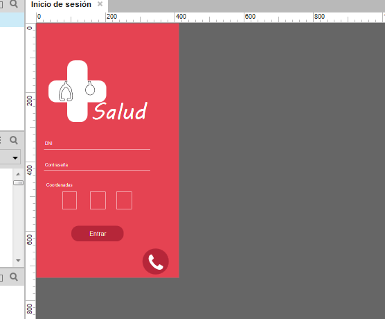
Finally, looking carefully it seemed to have badly the size of the screen. At the time when I started I chose the size of an Iphone 6+ but apparently it was not the right one and when I put the size right it already occupies the full screen when I publish it.
But when I see it on the mobile, you can move the screen, do you know how I can block it so that it does not move up and down?
On the other hand, in order to appear well published, do the screens have to be right in the corner of axure? Can not I put them in the center of the axure screen and then be published as well?
You can set your page alignment here
Then Set your mobile viewport
For different mobile screen size refer to this website
https://www.mydevice.io/
And also use the
CSS width and CSS height


