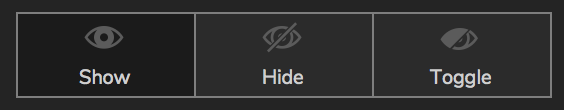
Anyone else having a difficult time making out which option for the Show/Hide control is selected while in dark mode? I always have to look really closely to make sure I have the right option selected, which slows me down every time. Is there any chance that this control can have a more visible highlight indicating the currently selected option?
I can see how a change to this design could be helpful. I’ve gone ahead and filed this functionality as a feature request for our teams to review on your behalf.
For future feedback on improving Axure RP 9, please email our support team at support@axure.com. This should help ensure that we’re able to file this feedback right away and make sure that it doesn’t get lost in the forums. Thank you!