I think I understand what you are trying to do in general, but some of the specific details are confusing. Do you have an example .rp file you can attach?
You can nest dynamic panels, yes. From what you have described, that wouldn’t be necessary as you could just hide/show rectangle widgets–like one for the border, one for the fill, etc.–although you could use some empty dynamic panels and style those instead of basic widgets if that’s what you prefer. Regardless, each of your four main states could have two or more widgets to accomplish all of this–showing text in a specific color/weight/font, background fill, and border.
Because you are creating this as a library element you’ll want to take into consideration how it will be used and understood by multiple authors–even just yourself in the future. Making the structure more efficient can make using it more complicated and more prone to unintentional mistakes. A single dynamic panel with 16 states is a more simple concept than a dynamic panel with multiple widgets or nested panels to contend with. It really depends on how this library element will be used, context, visual style guide, etc.
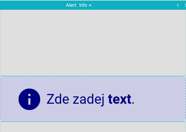
I try to keep my text widget/layer separate from styled containers–like a button with multiple possible colors, borders, etc. That way the text only has to get set once, instead of, say, 16 times. But, from your examples, the text has different colors to match the base color of your four main states. In this case, I recommend using a Text Field widget in the first state of the dynamic panel. Set it to no fill and no border, then style the font and color as needed. This will be the “master” text widget that will automatically control the text in the other states. The reason to use a Text Field widget is to take advantage of its Text Changed event–use that to set the text in all the other states to ensure they are all synchronized.
Axure doesn’t allow you to dynamically change the fill color of a widget, but if by “weak fill” you are referring to the same color with more transparency, you can dynamically control that with the Set Opacity action. But, you probably don’t want to control it that way in a library element. Better and easier for an author to change the dynamic panel to something like, “Strong with Border” or “Weak with Border” than have to know or remember the opacity level, like “Set Opacity to 47%” or whatever.
If your visual style isn’t too crazy, you can also use the “Interaction Styles” to define a few preset “looks”. For example, if your Success style can be either “weak” or “strong” you can style “Selected” to match your “strong” look. You can also utilize the “Disabled” Interaction Style for a third visual style, particularly if it is a “non-interactive” widget like a button background inside a dynamic panel state. This provides up to three visual styles for one widget. Based on my understanding of what you describe, you could set this up with just four states for your dynamic panel.