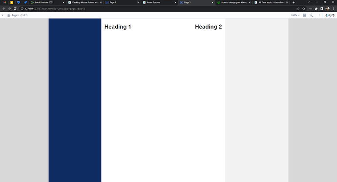
In my example I am trying to create a desktop web application that has a left and right sidebar that is attached to the window, matches the window’s height and does not scroll with the page content. I have that setup and working fine using the “Pin to Browser” on Dynamic Panels.
My desktop web application expands the center section (the white section on the screenshot) with the window. For prototype purposes I DO NOT need that functionality. But I do need Axure to maintain the set width I have so that the center content appears near both the left and right sidebar. But when I preview it in Axure it can only center the page content between the sidebars, or left aligh the page content between the sidebars. Or the alternative is to give the page a set height and width, but then Axure displays a GREY TOUCH cursor/pointer instead of a normal desktop pointer.
PREVIEW with SET WIDTH and HEIGHT: Causes the mouse pointer to be a large grey circle.
Depending on how complicated the content of your center column is, making it responsive could be a bit of a chore; you’ll need to manually resize everything that needs to be resized using the page’s “window resized” action. This is one area Axure could stand to improve. It would be great if it could just handle this with a simple CSS rule.
If simply using a fixed height and width will work for you, you can create a new page with an inline frame of whatever size you want, and set your application page as the target of the frame.
Here’s an example of both. The “frame” page constrains the app to a fixed width and height. The “main app” page resizes the middle content with the page:
fixed-width-desktop-app.rp (61.4 KB)
Hope this helps!
PREVIEW with NO HEIGHT set: Displays a normal desktop pointer which is what I want. But the page content now is not near to the right sidebar.
PREVIEW with NO HEIGHT and page centered: Displays a normal desktop pointer. But the page content is not near either sidebar.
Now I don’t actually care about the responsiveness of this preview, I would be fine with the set width and set height preview, but I am not fine with the mouse pointer/cursor being a large grey circle. I want it to look like a desktop experience but not responsive.
If there’s a way to make the center white section of the preview responsive between the two sidebars. That may also work.
Any help appreciated!
Looks like our messages may have passed each other like ships in the night. Take a look at my last response and see if that does the trick for you.


