Hi guys, maybe you will be able to help me with something. I would like to publish my project without the player visible. I know that if you delete some part of the link and add html at the end, the player disappears. The thing is, if you do that, the scalability (fit to width) is automatically switched off. I have adaptive views in my project for web and mobile and without the scale option (which you can check in the player bar) I can’t properly view the project on my mobile device (it doesn’t fit the whole screen).
Does anyone know how to remove the player while keeping the scalability? I think it is represented by the “sc=1” part at the end of the link. Tried to add “html” after it but it doesn’t work. I don’t get why it is so difficult to get rid of the player…
Yeah, all this gets kind of confusing. Here is the Axure documentation for hiding the prototype player and getting URLs to show the “raw HTML” without the player frameset:
The “fit to” scaling options are part of the prototype player, so if you hide the player or load pages without the player you just won’t get them. Most browsers have built-in scaling options (Ctrl+ and Ctrl- for instance) which might help.
Adaptive views are different and separate from all this, though. If you’ve set up your breakpoints properly for the devices you need to support then it should work OK. The width of the browser window determines the adaptive view that gets shown. You can also dynamically set/change the adaptive view with the Set Adaptive View action.
In addition to this, you can dynamically resize widgets and locations based on the browser window properties, for example, "Set width of MyHeaderBackground to [[Window.width]]. Adding some actions to the Window Resized event can provide automatic scaling in real time. You can also create dynamic panels which can be pinned to a specific location, for example a main call-to-action button can be pinned to the bottom right corner of the browser window. It does tend to take some trial and error tweaking to get things right.
If there are specific problems you’re dealing with, it will help forum users help you if you could post a sample .rp file here with as much details as you can provide.
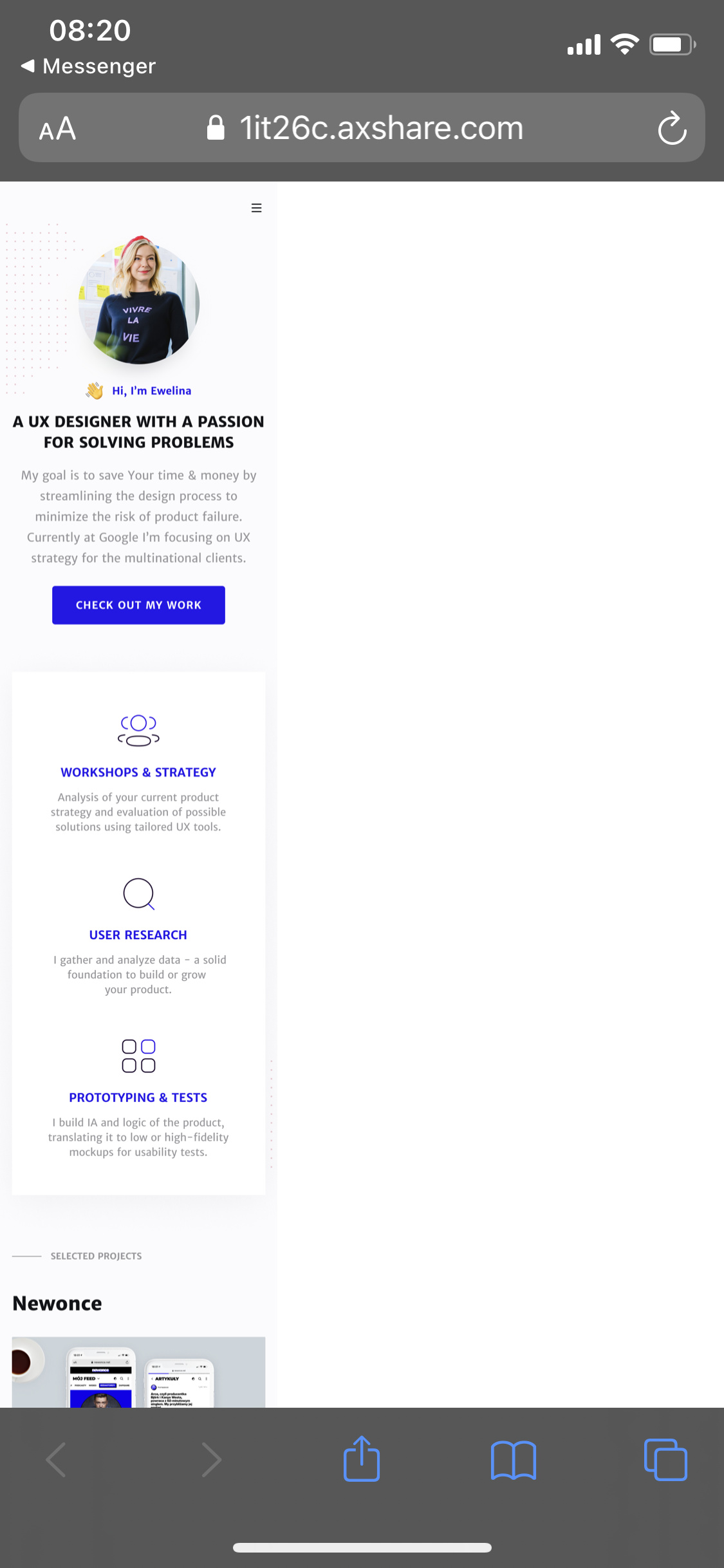
Thanks for your swift reply! Ok, maybe I’ve messed up the adaptive view settings then, no idea… I’m attaching a piece of the file I’m working on. When I set the scaling option in the player and use this link on my mobile, everything works perfectly (I have iPhone X). But when I change the link to this: Home it stops working on the phone (see screenshot attached). What am I missing?
Aha… I didn’t realize another important thing: Adaptive Views require the prototype player also. (Which makes sense in the same way that its custom scaling options require it.)
I guess I’ve never had to worry about this because when viewing an Axure prototype on a mobile device it just works–the desktop prototype player isn’t shown and things are shown in CSS pixels and not actual pixels. Same for the Axure Cloud app, which I tend to use instead of a browser on phones and tablets. (And this is generally true for other popular prototyping tools as well.)
Is there some reason the “regular” URL for a prototype won’t work for you on mobile? Actually, one single URL that should work the same on mobile and desktop should be https://1it26c.axshare.com/#c=1 (where “c=1” is a hash that Axure uses to collapse the prototype player’s frameset.)
If that doesn’t work for you, another approach would be to just use two different URLs depending on device type:
(and maybe include a button in your header, footer and/or menu to switch to the other view, like “View Mobile Site” and “View Full Desktop Site”)
So, an important thing to understand when designing and developing for mobile is the difference between “actual” (also known as “resolution” or “device”) pixels and “virtual” (aka “standard” or “CSS”) pixels. Let’s see if I can explain this well enough… For example, the iPhone X has CSS pixel density of 375 x 821, but device pixel density of 1125 x 2436. This is 3 times more pixels, which is why your “raw page” is 3 times too small without the prototype player (which renders prototypes in CSS pixels not device pixels.) It turns out that pretty much every brand and model of mobile device have different display resolutions and raw device pixels (here is a good site that tracks all iOS device resolutions: https://ios-resolution.com/ ) This article explains all this in more detail: https://medium.com/@flik185/understanding-device-resolution-for-web-design-and-development-3bb4a5183478
Another aspect of your prototype that I think is causing this problem is it is pretty much all images–and browsers interpret images in actual pixels, not CSS pixels–to take advantage of all that resolution density. So, when your images are 375 px wide in Axure, a browser shows it at 375 actual pixels wide, instead of scaling it up 3x to 1125 px. (This is also why designers commonly need to supply multiple sizes for raster images like JPG and PNG …and why scalable vector graphics are much better for things like icons.)
Thanks for the cues. I didn’t want to use the regular link because I wanted to give the impression that this is almost like a real website (when it has all the interactions, of course, they are not in the piece I’ve sent). Also, if I’m sharing this with people, I don’t necessarily want them to have access to the page list etc. I would prefer them to navigate through this like a normal website AND have a mobile view - is that too much?
But hey, thanks for the tip about “c=1”, didn’t know that and this is probably something that will help a bit. Also, I wonder if it would help if I just exported the image from figma in a higher x…?
Still, I think with a program that has so many options and so much flexibility, it should somehow be possible to hide the player without affecting other settings.