I feel somehow stupid, but I cannot figure out how to style the various states of a Checkbox in Axure 9. I have found, where I can set the image for the checkbox in the widget style for the default style, however how can I set the other images for the other states? I would expect to be able to set different style effects for a Checkbox (where I then could set other widget styles for the different states), however the menu entry is missing for a Checkbox.
OK, finally found out how to get to the Style Effects via the INTERACTIONS tab and it works now. The bad thing is that this works only once as long as the style effect is suggested via Common Interactions. Once set this suggestion is no longer there 
I assume the missing Style Effects… entry on the context menu is a bug?
Hi yaba!
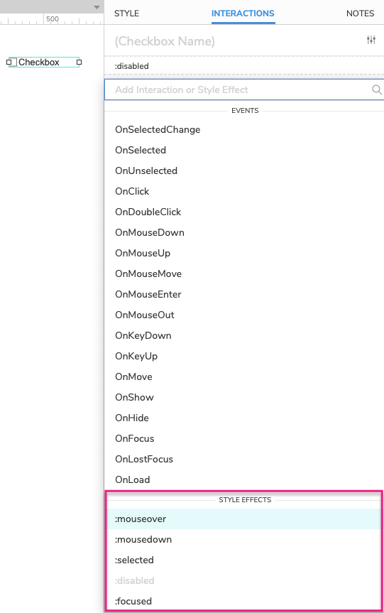
The rest of the Style Effects options for the checkbox widget should be accessible by clicking the “New Interaction” button and scrolling to the bottom of the Events dropdown menu:
I hope this helps!
This topic was automatically closed 7 days after the last reply. New replies are no longer allowed.