Interactions Condensed View


#1

Hello! Earlier this week, as of beta build 9.0.0.3624, we’ve added a new option for viewing interactions. This new options is “condensed view”, which compresses the space dedicated to showing the interactions in the pane while in reading/viewing mode. We heard your feedback about wanting to view more of your interactions in a shorter space, especially for those with complex interactions who need consume a lot of information at once, and are used to the more condensed readability from RP 8.

If that’s you, please turn on this viewing mode and let us know what you think. You can go to “File > Preferences” on Windows or “Axure RP 9 Beta > Preferences” on Mac. In the “General” tab, under the “Interactions” heading, check the box for “Condensed View”.

Let us know what you think about this change. Are you seeing enough of your interactions? Thanks!


Initial beta feedback
#2

I am also surprised that nobody has written anything about the “condensed view” yet.
The shock was probably too big, so they switched it off immediately :slight_smile:

Seriously:
This is definitely a step in the right direction.
However, for high-resolution screens rather not usable.
Due to the small font size in a small space and the inconspicuous icons, the handling becomes more difficult.
The question of whether you need this view on high-resolution screens at all is, of course, a legitimate one.
Unfortunately yes, because also with the previous variant and more extensive scripts parts disappear in the nirvana :-).
Is there possibly a chance that we get a condensed view with better readable fonts and better recognizable icons?

I’m curious what others will write about it.


#3

I too think this is a step in the right direction. I see that the design principle at work in the new interactions panel is to have all the interactions be a visual block. Generally speaking, I agree with this.

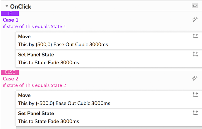
Where it still isn’t working for me is the hierarchy. In the new model, cases “belong” to an IF group or an ELSE group. The visually important thing is the IF or ELSE. Then within that group, everything, conditional logic + interactions, are visually equal:

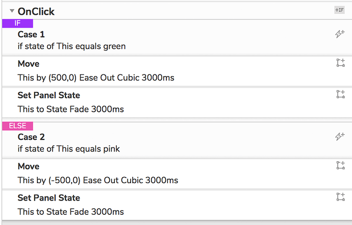
The way I think of cases is that any conditional logic belongs on the same visual level as the IF/ELSE. I see that there’s been an effort to visually differentiate the logic from the interactions, but for me, it’s not enough to be scannable. I would humbly propose that the team consider something like this:

At minimum, having some indentation and not extending the interaction blocks all the way to the edge of the panel would be hugely helpful.

Thanks for reading :slight_smile:


Initial beta feedback
#4

i agree with lshillman
that’s a good idea


closed #5