Is responsive design possible in Axure RP?

rp-7

#1

First, a couple of definitions. Responsive design, one of the biggest recent trends in web design, is the use of proportional, fluid layouts that adapt and fit perfectly to any screen of any size. Adaptive design, sometimes thought of as a precursor to responsive design, typically makes use of set breakpoints to determine the best version of a design to show based on the size of the screen and the assumed capabilities of the device. Responsive designs frequently make use of breakpoints, but adaptive designs usually lack fluidity.

To put it bluntly, responsive design isn’t possible in Axure RP. Responsive design is predicated on fluid grids and dynamically resizable elements. But in order to function as an effective and predictable prototyping platform, Axure RP depends on exact calculations for size, spacing, and arrangement of elements in the design. To maintain this precision and as much user-friendliness as possible, Axure RP handles breakpoints adaptively, rather than responsively.

Still, you can use Axure RP to plan for responsive design, using adaptive views. This allows you to create set breakpoints that will change the layout and content of your page depending on the width of the viewing window. Some people assume that this means Axure RP can only be utilized for adaptive design, but that’s not necessarily the case. In a comparative article for Smashing Magazine, Christian Holst argues that adaptive design principles can actually be more effective and more easily implemented in testing and development than responsive ones. Why’s that? In short, adaptive views are extremely predictable. They allow you to plan for a set number of screen sizes, and hence potential changes to your design, while starting responsively forces you to plan for every imaginable screen configuration. On top of that, you’re likely to incorporate fixed breakpoints in your responsive design already—4 columns of content compressing to 3, a navigation bar scaling down to a hamburger menu, etc. Prototyping with adaptive principles allows you to communicate those changes simply, effectively, and predictably.

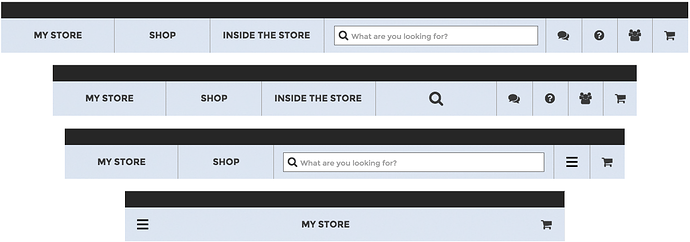
As an example, consider the homepage for the clothing brand Patagonia, which, I should point out, was not necessarily built in Axure RP. This is a (mostly) responsive website with a navigation header that perfectly fills the width of the browser window. To account for different window widths that are likely to be encountered on desktops/laptops, elements of the header change so that things don’t get too crowded. The search bar is elastic throughout, and in a very narrow range of screen sizes is condensed into a magnifying glass that reveals a text field when hovered over. As the window continues to shrink, the “Inside Patagonia” link and live chat, support, and account icons get compressed into a hamburger icon to save space. Throughout these changes, the search bar adapts fluidly, either resizing, recentering, or both. Finally, at 767 pixels and under, the entire page shifts to a mobile-oriented design that fluidly adapts to the size of the window.


So how does adaptive design help us here? By defining each breakpoint—the base design wherein all header elements are visible, the points at which various elements shrink or expand, and the the point at which we get a mobile view—we can design around the changes to the interface without worrying about every per-pixel shift. I’ve put together an example, modeled after the Patagonia site, based on these breakpoints to illustrate the utility of adaptive design in the prototyping process.

With that in mind, here’s what a hypothetical prototype for patagonia.com, built in Axure RP, might look like. My hope is that this helps to illustrate the utility of adaptive views in communicating ideas for what will eventually become a responsive final product. Thanks for reading!

Creating full screen web app
#2

Adding Responsiveness

As part of my training for the Axure support desk, I decided to see just how close I could get to responsive design in Axure RP. To do this, I took my Patagonia-inspired adaptive design and figured out how to hack in some responsive-like behaviors in order to capture a touch of that great window-hugging fluidity–check out the link below. I accomplished this using one of the unsung heros of Axure RP’s Page Interactions, OnWindowResize. I wouldn’t exactly recommend this technique, as it introduces a lot of extra work and adds extra overhead to the prototype’s performance, but in small doses it could be used very effectively to add some of that whiz-bang factor that we all know and love.

If you’re interested, check out my .rp file at the bottom of this post as you follow along!

To start with, let’s look at the Patagonia breakpoint chain. Between 1025 and 1200 pixels, all of the interface elements are fully revealed. Between 981 and 1024 pixels, the search bar turns into a magnifying glass. Between 768 and 980, the search bar returns but several other items are compressed into a hamburger menu. At 767 and under, the design switches to a mobile-oriented version.

There’s one additional breakpoint, which is everything over 1200. Nothing is added, and certainly nothing is compressed. But the left portion of the header stays to the left, the right portion stays to the right, and the search bar expands to fill the space. I could have put the right-side items in a dynamic panel and pin it to the right, but that’s not all that flexible (for example, a pinned widget won’t scroll without extra work). Instead, I used the OnWindowResize event, which is also triggered when the page first loads, to move them dynamically. Written in plain English, that means I moved the object “RightSideNav” to a coordinate equal to the width of the window minus the width of RightSideNav. Or, in Axure RP-speak:

Move RightSideNav to ([[Window.width - LVAR1.width]]), where LVAR1 is defined as RightSideNav


Now, my right-side navigation items stay pinned to the right side of the window. The moving search bar is a little trickier. In my design, the actual search bar is contained in a larger dynamic panel that fills the gap between the left-side and right-side navigation. To keep that larger dynamic panel sized properly, I set it to the width of the window minus the width of LeftSideNav and minus the width of RightSideNav. Then, I moved the actual search bar to the width of the dynamic panel minus the width of the search bar, all divided by 2. The search bar is 356 pixels wide, so if the dynamic panel is 400 pixels wide it’ll be moved to 22 pixels ((400-356)/2).


Similar math will allow the rest of the interface to fluidly move around as the window is resized, such as keeping the magnifying glass centered in the 981-1024 view. One tricky little thing I’ve done here is to handle the resizing of the search bar. At the time of writing, working in Axure RP 7.0, the only widget that can be resized is the dynamic panel. That means that the border around the search box won’t get resized the way I want in a responsive design. To get around this, I wrapped my search bar and surrounding border in a dynamic panel. When I reduce the horizontal size of that dynamic panel, the right border is cut off but everything else remains intact. To account for this, I made a small shim image to simulate the right border. This shim gets moved to the right edge of the containing dynamic panel whenever it’s resized to give the appearance of an intact box around my search bar—nifty!


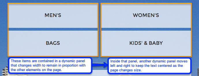
Another handy trick that I used, once I got cookin’ with math, is to simply use one breakpoint for all screens under 768 pixels wide, meaning 767 or less. (That means I could have removed the 480 and 320 breakpoints entirely. However, because adaptive views are applied to the whole project and because in this example I wanted to be able to quickly toggle between the designs, I left them intact. Generally speaking, fewer adaptive views means less computing power needed.) The 768 breakpoint will still display on an iPad in portrait mode, but everything smaller will get one, consolidated design. To set this up, I expanded my 480 design out to 767. I needed a bit more trickery to make everything work, though, because this mobile-oriented design is all rectangle widgets with centered text that need to shrink or expand based on the window size. The first row of the interface, for example, has a “Men’s” button and a “Women’s” button. There are 35 pixels of space on either side of the row, and 10 pixels of space between the buttons. That 80 pixels of total space needs to be preserved. To get the buttons to both resize and have their text centered, I actually needed to encapsulate each button in two nested dynamic panels. The top level panel is the one that actually gets resized to the width of the window minus 80, all divided by 2. Then, the bottom level panel is the one that keeps the text centered by moving to the width of the top-level panel minus 335 (the initial width of the button), all divided by 2. This same math is then applied to all of the remaining interface elements.


Check out the responsive version of the prototype in action, and please see the .rp file attached at the bottom of the post.

I’ve built a handy toggle that switches between the adaptive and responsive sides. Notice that the responsive version has a bit of lag as you resize the browser window—the elements need a moment to catch up with the borders. There’s also the issue that if one single calculation is entered incorrectly in Axure RP, multiple components can break. In short, it’s hard to recommend this technique except in small doses. A little bit is pretty cool, but a lot of it can start to cause headaches.

Has anyone implemented anything like this? Have you had success in adding responsiveness to your prototypes? I’d love to hear your thoughts or questions about this!
ADAPTIVE-RESPONSIVE.rp (1.28 MB)


#3

Hi there Jonathan! Do you happen to have an updated version of this in Axure 8? Thanks!


#4

Hi bildiko!

We don’t have a newer version of this file that would reflect 8.0-specific updates. But that attached v7 file can certainly be opened and viewed in 8.0. By and large, simulating responsiveness is fairly similar between 7.0 and 8.0, albeit the current version now has the added ability to dynamically resize shape widgets (not just dynamic panels).


#5

The closest I’ve got is demonstrated in my Responsive Widgets solution with some videos. The template includes configurations & guidance for generating prototypes for a wide range of mobile devices from an RP file using the Initial Scale parameter. You won’t be able to resize a web browser and watch content reflow unfortunately, but this isn’t a real world use-case anyway.

The caveat; this is technique is more for facilitating testing with users (and impressing clients) however because this scaling technique affects the height as well as the width of widgets.

When passing design to developers I communicate that each adaptive view covers a range of device viewports. They can then derive % width values from each view that goes into the CSS. This usually works fine. Alternatively you can specify explicit % widths for widgets in annotations if things get tricky with full-width imagery and the like. At the end of the day, you can tweak the breakpoints once you get into production code very easily.

The solution includes a framework template (RP) which is mobile-first; incorporating an adaptive menu & paging system. There’s adaptive widgets (RPLIB) which you can drag & drop and they adapt as you drop.

It was built in v7 but works in v8. I hope to do an update of it shortly…

Hope this is helpful…


#6

This is a very creative workaround, but ultimately Axure needs to step it up and move away from Adaptive Views and build a responsive wireframing tool. Too many competitors doing it already to ignore this any longer.


#7

Who is doing it already?

I don’t think it’s particularly creative. Deriving % values is common sense really. The only question when taking this approach is whether to have % margins or fixed.

I don’t think it’s worth Axure’s time to put into doing this. They have bigger fish to fry. I think the styling needs to be far far closer to replicating the real thing with Sketch and Zeppelin dominating this space…


unlisted #8

closed #9