
Hi there,
I started using Axure 9 a couple of weeks ago, and love Cloud share features overall. But I can’t seem to solve this problem.
This is how the design should look which is rendered correctly on Local Preview.
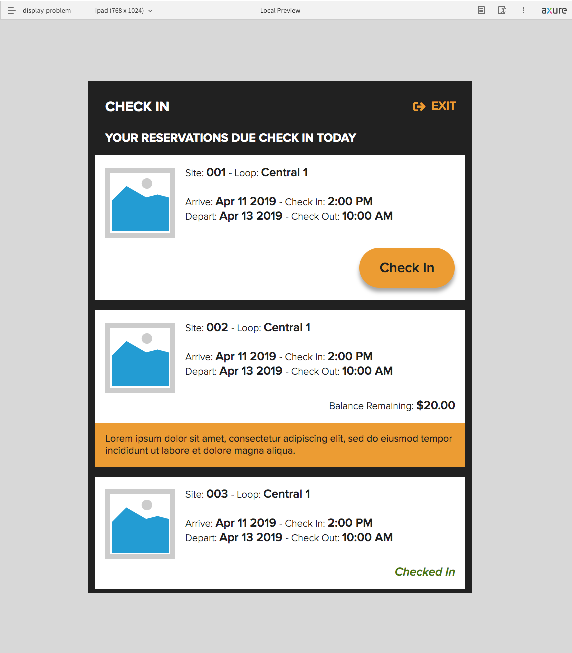
When I publish it, a gap between the second white box and the orange box appears.

I even tried to add a box below that group, but this time that box exceeds below the orange box.

Why Cloud share renders different from the Local Preview? Any suggestions on how I can solve this?
Thanks in advance!!
