Hello,
When using Axure RP 9 the adaptive view does not work on mobile devices. It works when scaling a desktop window to smaller proportions and widths, but opening from a mobile device just shows a smaller scale desktop window. I know that axure RP 8 addressed this problem but unfortunately not in Axure RP 8. Has anyone found a solution to this issue?
Phil
I’m having the same problem.
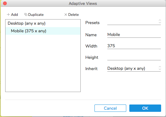
These settings from Axure 8 work fine in Safari on iOS.

But when I open the file in Axure 9, it gives me these settings but doesn’t show the mobile view in Safari on iOS.
1 Like
I’m having this issue as well. My adaptive prototypes mostly work when viewed on a laptop, but try to view them with an ordinary browser on a mobile device and they mostly look like tiny desktops. Seems like what I used to see on previous versions when I forgot to use the viewport tag, but that checkbox no longer appears in the publish settings. Argh!