Hi!
I had a question about the screen size of the products versus the screen resolution of my device (a laptop with 1920x1080 screen).
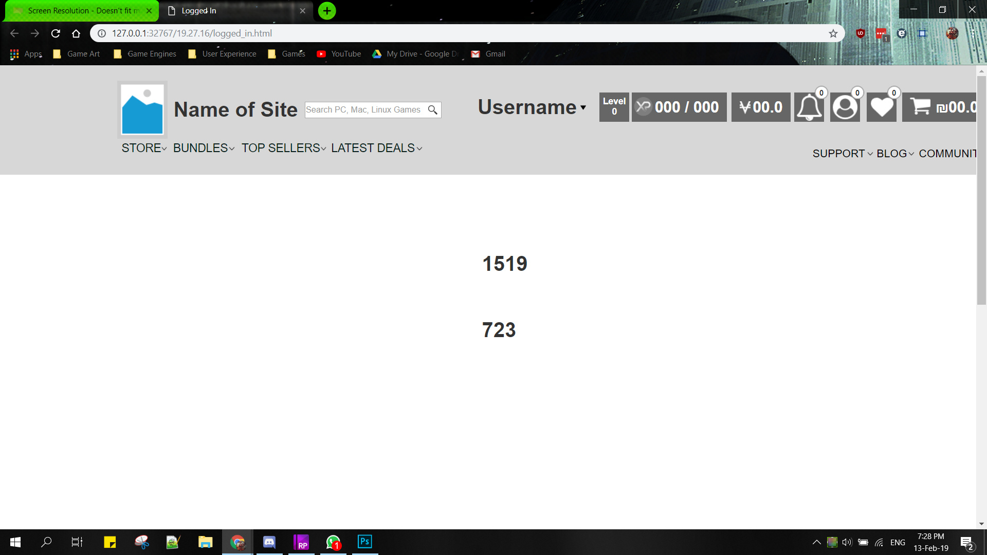
When I made my prototype at 1920 pixels wide it wasn’t actually shown at that resolution but it was shown at a much larger zoomed in size. And I’m not sure how to fix that. I also started off by trying to measure the actual screen that was shown and the output I got was actually 1688x804 instead. I’m not really sure why that happened - but then for some reason something changed and now it’s showing for me as 1519x723 and I have no clue what changed or why.
Here’s a screenshot of how it looks when I preview it:
Your browser display area (not the browser window) will always be a smaller resolution than your screen. Thus if you make a 1920x1080 prototype on a 1920x1080 screen, there are only two ways to see the full prototype:
Zoom out in your browser
Make your browser window fullscreen
The numbers you see in the middle of the screen are the pixels of your browser display area (i.e. the area showing your prototype. If you change the size of your browser window and refresh, those numbers will change.
I see you also tried to set up adaptive views by using both a value for width and height. You had adaptive views turned off by the way. Typically you only need to use width, unless you’re developing some next level any screen dimension design. Very few designs you will find use height in adaptive views.