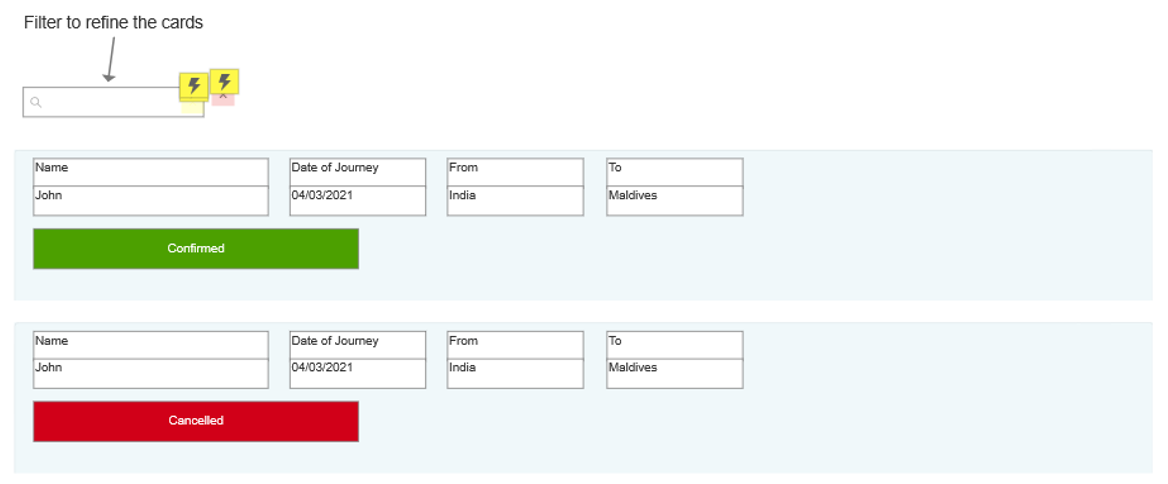
Recently I am working on a project where the client need to use filter option so I have used repeaters and implemented that feature. Now the problem is that I am having two types of cards (confirmed, cancelled), is it possible to have two different card UI in a single repeater. Below I have attached image for reference. Pls help me out on this. Thanks in advance.
Yes, this is possible and I commonly use dynamic panels in repeater cells. Give it a shot!
In your screenshot it looks like the only difference is the button style and label–although the labels make it seem like they aren’t buttons but rather state identifiers–for the type of card (if they are not buttons you might want to rethink the location and size because they look so much like buttons it could be confusing.) At any rate, if this is the only difference, you may not even need a dynamic panel–just a Selected style for the Confirmed/Cancelled widget. Logically, it certainly makes sense this widget could be a dynamic panel with two states–or any/all widgets in the repeater. If the other widgets never change based on card type there is no reason to replicate them in a dynamic panel state–it just gives you more widgets to try to handle and synchronize.
So, from your example, two different approaches I would recommend–pick which makes most sense to you.
Dynamic Panel
a. Select all the widgets that will vary between the two card types, right-click and choose “Create Dynamic Panel”
b. Duplicate or create new state and style the widgets in second state as needed.
c. Repeat for as many states as you need.
d. Change the state based on a column value with a conditional case in Item Loaded (and by user interaction as needed). Best if you have a column dedicated to this, like “CardType” with possible values of {Confirmed, Cancelled} or maybe “Cancelled” with possible values of {true, } --where a conditional case in Item Loaded can test If [[Item.Cancelled]] equals "true" Set Panel State to Cancelled"
Selected/Unselected States
a. Select the “Confirmed” widget, and in the INTERACTIONS pane select “add a style effect”, choose Selected style and set the color, etc. as needed for the “Cancelled” card/state.
b. Create a “Selected” event of this widget with an action of Set Text This to "Cancelled"
c. Create a “Unselected” event of this widget with an action of Set Text This to "Confirmed"
d. You can handle this in same manner in Item Loaded or whatever user or system interaction, but rather than Set Panel State use Set Selected/Checked