Does anyone have a better way to edit styling for error states on inputs and other form fields? I was really hoping that there would have been an add-on for "ERROR’ along with the hint and focused styles.
This could have also been done with using the selected style but you can’t set form fields to selected state.
I’ve done custom error styles on form fields using dynamic panels, but I refuse to go back to that method as it adds an insane amount of performance hits and complexity that just seems silly.
I’ve created error handling and states exactly as you show in your example; outline the input field in red and show an error message below it. I typically don’t use dynamic panels, but I also haven’t seen performance differences with dynamic panels. I’ve had pages with dozens of input fields which have worked quite well.
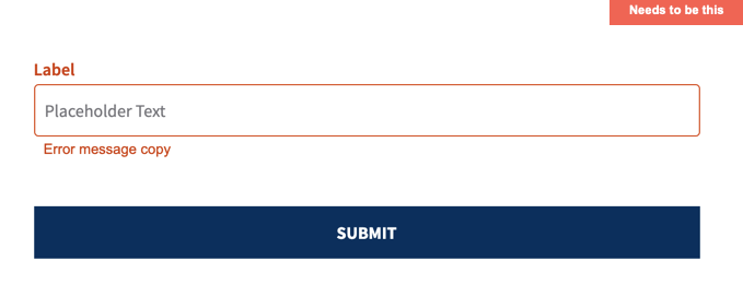
I would love to have a built-in Error or Selected state for input fields, and I know this request has been received and considered by Axure. Because the “Forms” widgets are “standard HTML” they are for the most part styled and handled by the browser. So, my basic approach has a group of three widgets for every user input field: a text field, a box widget behind that field to serve as the border, and a widget for the error text, just below or above the border and hidden by default.
The box widget behind the input field is larger than the input field—just enough to show its border. (Or you can set the input field to no border and no fill.) I use the box widget’s selection state for the normal and error styling (selected state has red border.) In its OnSelected event, I have a “Show errorText” and in OnUnselected “Hide errorText”. In the input field’s OnTextChange or OnKeyUp event (or in another “submit” button) I have a series of conditions to test for errors. If an error, it sets the text for that field’s errorText widget and set the border widget to selected.
I’ve also used this “group of 3” approach in a repeater for long surveys or chat simulations with success. You can also create one of these as a Master and/or a custom library widget for easy reuse.
This is how I have done it in the past. I really don’t care for this solution. It needs to be more dynamic. Other than the performance hits I get, I also have to allow my apprentice level users to work with this library and it’s not as easily consumable for them.
This feature doesn’t seem like a complex request. I may also consider having to write a plugin script just don’t want to add that to my backlog anytime soon.