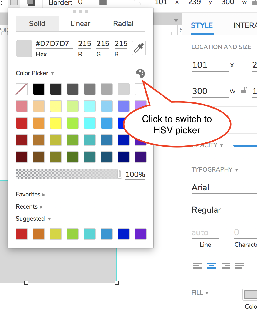
You can use the HSV picker to set the color on any type of widget. To switch between the color swatches and the HSV picker in the color selector, click the palette icon at the top right of the color selector:
In the RP 9 Promo material, you have mentioned enough that it is HSV. But what i see in RP9 Interface is RGB Picker NOT HSV/HSB
However, i fail to find the picker for Value / Brightness and please be informed that i do not want to use Transparency / Opacity.
Opacity / Transparency can get me a visual hierarchy i want with colors, But, when the widget is above any other widget. The transparency/opacity causes issue.
To be More explicit, please look at below screenshot.
Also, point it out to me if this can be achieved or this is hidden somewhere due to the new minimalism.
Our HSV picker is visually a little different from your example, but you can select your color by hue/saturation/value just the same. Here’s an illustration:
The vertical slider on the right selects the hue shown in the rest of the picker. The horizontal axis of the central picker represents the saturation of your color, and the vertical axis represents the value.
One difference with our picker is that you can’t input numeric HSV values. Let me know if that’s what you were expecting or if there’s something else you’d like to see here.
What you suggested is functional but not usable.
My thoughts: Defining Color for a Widget
I can to to external tools, view various shades and copy the hex and paste it here. (In-efficient)
Keyboard is more efficient than a mouse.
I also bring the understanding of HSB/V from other tools (XD/Figma)
Creating Color variations in widgets
I apply a color to a widget.
Now i want to apply a less saturated color of the same hue to another widget.
With RGB Values this is painful.
With HSB values, i can punch in the same values.
So, YES, HSB Values alongwith the current ones would be much better.
I checked in RP 8, and found that HSL is still there but its on click of “More” from the color picker.
I really just want the old color swatches back. The new picker is much more finicky, slower and less intuitive than the one in Axure 8. Which incidentally worked similar to the swatches in Adobe products and the basic Windows color picker. Upgrades that add functionality are great. Downgrades that replace useful functionality, less so.