On selection of one of the options, I have the dropdown now reflecting the selection, however I want the container to expand to fit the text string and icon to move to the right also to arrive at this:
I have tried setting the size of the container using the following function. However it doesn’t seem to work.
You’re on the right track. The reason your function didn’t work is because you used “text on widget” instead of just “widget” when you set your local variable.
Depending on how you build your list, you can use the size of the widget containing the text as the variable instead of hard coding the widths of each, individual option: Resize_Dropdown.rp (62.0 KB)
So I’ve tried to reconstruct the module, I’m getting closer to the desired behaviour thanks to your input, however I am still facing a couple of nitty gritty details.
The flyout closes when I focus out of the area with the mouse, it should stay open
The flyout doesn’t close if I tap on the dropdown again
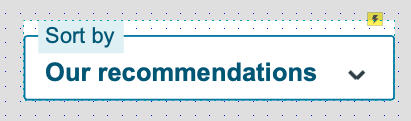
The dropdown stays in an active (blue) state even if no selection has been made from the options
The chevron does not rotate
Extra:
I have multiple of these dropdowns on a horizontal plane. Do you know how I could go about utilising the resized dropdown to push the rest of them to the right? Dropdown sample.rp (69.5 KB)
As far as the drop list closing on mouse out, it’s a built-in behavior for the “treat as flyout” option when showing a widget. If you want it to stay visible on mouse out, just set the option to “none”. You’ll have to use some other trigger to hide the list. The easiest way is to use “Page Click” to hide the list if the cursor isn’t over it.
You can tackle the other three issues a few different ways, but it basically breaks down to needing a trigger to reset everything back. Since the dropdown button is a dynamic panel, setting it to “selected,” also sets all the widgets inside of it to “selected” as well. (The same is true for “groups”.) I set the chevron icon to rotate 180° whenever it was selected or unselected.
The trigger I used to “reset” everything was to have the list widget set the dropdown button to “Unselected” whenever it became hidden. That would set the button back to its default styling and rotate the chevron. Having the button to show or hide (toggle) the list onClick will set everything back to default.
You can dynamically move the row of dropdowns by setting up a kind of “cascading trigger.”
Whenever the first dropdown is resized, have it move the second one to its right plus whatever padding you want:
On Resize, move "second dropdown" to [[This.right + 8]]
Then, on the second dropdown, set it to move the third one whenever it is moved, and so on.
Hopefully the example will help clear things up: Dropdown sample.rp (72.3 KB)
Sure. You just can’t use chevron’s “selected”/“unselected” interactions to set its rotation anymore. You could set it up where clicking the dropdown rotates the chevron to the “up” position and have the list rotate it back when it hides.
If I understand you correctly, another way of describing what you want is to say, “The dropdown has the selected style only when open or is not the default option.” If that is the case, then when the list becomes hidden, it checks to see if the text on the dropdown says “default”. If true, then set the dropdown to the “unselected” state.
While we’re here, I have another question based on the previous file.
Is there a way other than reloading the page, where after a selection has been made, the whole bar is reset to the original state ie. setting sort input to default + unselected and moving the remaining options back to the left?
Sure. Just set your tabs to reverse everything when they’re selected. You already know the width of the default dropdowns, so just use those numbers when resetting the size.
Make sure the action that set’s the default option in the menu is fired first, otherwise it won’t work.
That’s what I tried, however same as what happened in your file, the remaining dropdown options don’t move back to the original position, but move forward since we have the resize trigger.


